Organizations with a Flexwhere Pro or Enterprise license have access to the Flexwhere Dashboard.
This dashboard provides insight into the use of workstations and meeting rooms in their organization, among other things.
The daily data
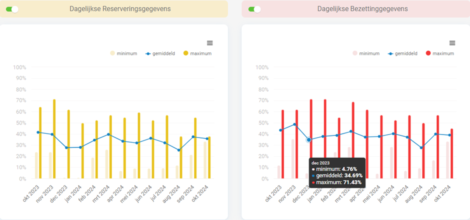
On the statistics tab in the dashboard Flexwhere has daily data that is displayed.
This data provides an overview of, among other things, the reservations and occupancies made on a day.
These are displayed in a graph per month.
The data is calculated by looking at workstations, meeting rooms and more depending on the filters applied, and will count usage when usage has been observed at a single time during the day.
That is, with 10 workstations in your organization, if you occupy two workstations for five minutes one day that will calculate a 20% utilization rate for that day.
The same goes for reservations.

In addition to the two daily graphs, you will also find a weekly overview which provides direct insight into which day, on average, is the most popular in your organization.
You can also find an overview of object usage based on labels.
You can add these labels yourself to objects in your organization.
By adding the right labels to your objects you can, for example, easily create an overview of which kind of workstations are most popular in your organization.
Think of labels like Single monitor or Double monitor, or Stand up desk.
If all double monitor workstations in your organization are always occupied and the single monitor workstations often remain empty, it could be a sign that more double monitor workstations are needed.
Of course, the labels can be freely added as desired.

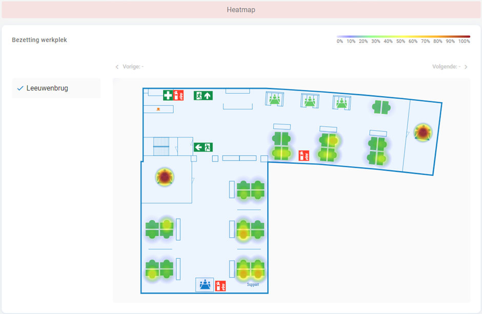
Finally, the statistics tab provides another so-called Heatmap.
The heatmap gives organizations a visual image of object usage.
At a glance, you can immediately see which workspace or meeting room is used the most.
This object will then become more yellow or red.
Objects that are little used will show no or little glow.


 Eddy
Eddy